Below, we will discuss three important steps to creating PDF documents that have clarity and impact. Specifically, we’ll look at the value of editing, utilizing the principles of visual hierarchy, and employing the correct format when you export or save.
Step 1: Get a Second Opinion
For a document to be clear and impactful, it must be free from errors. Even the most profound thought can be easily overshadowed by distracting errors or awkward phrasing.
If you are composing a document, consider getting a second opinion on the content prior to publishing. This may include asking a colleague to look it over, but there are ways of getting other “eyes” on your copy even if you work alone.
Proofreading for errors is a good starting point. You can use a service like Grammarly to catch misspelled words and grammatical errors. You may also receive suggestions on how to phrase sentences in an active rather than passive voice or make them less wordy.
Artificial intelligence (AI) is a powerful tool for editing documents. Most AI text generators accept and respond well to prompts such as “Optimize this letter/article/ad copy/etc.” There are also application-specific tools. For example, you can use an AI resume reviewer to ensure your resume includes as many keywords as possible from the original job description. As always, be sure to review AI suggestions for accuracy and make any needed corrections prior to using the document.
Step 2: Guide the Eye
Did you know that the visuals of your document can be deployed strategically? The design principle of visual hierarchy is used to indicate levels of importance and guide the eye of the reader. This, in turn, helps them understand the information presented and prompts the appropriate action.
Type, Size, and Headings
Research has shown that people tend to skim documents in a “Z” pattern—the eyes travel across the top, diagonally to the bottom corner, and across the bottom. Similarly, text-heavy documents are often read in an “F” style—readers skim the first line of each paragraph, their eyes tracing an “F”-like pattern across the page.
As a document designer, you can use this to your advantage. Use headings with a larger type size in these areas to draw attention to the most important information. Ask yourself, “If someone only read the headings, would they get the point?” If not, rephrase your headings.
Keep this reading pattern in mind, too, when considering the stylistic placement of letters. When writing in English, any single word, even in a logo, should be read either from left to right or up to down. Stacking letters in any other configuration may leave readers stretching their heads, so to speak.
A standard typographic hierarchy has three levels—headings, subheadings, and body text. Remember that the largest type will stand out the most—it’s prime real estate to get your most important message across.
Use smaller types for text-heavy copy, but exercise caution—types that are too small or large, unbroken blocks of text will likely be ignored entirely. Usually, you shouldn’t choose a font size smaller than 12 points; it should be even larger for large-format documents like posters. Break up your text into paragraphs or bullet points with white space in between.
Finally, select the right font. Stylistic fonts can be fun, grab attention, and convey meaning—for example, a creepy dripping font or a bold, theatrical one. Make sure, however, that your font is readable. If it takes longer than usual to figure out what a message says, the reader will likely move on to something else. Embedding fonts in PDF is one of the best ways to ensure that fonts are always available, even if the publication is moved to another computer or sent to a printer..
Color and Contrast

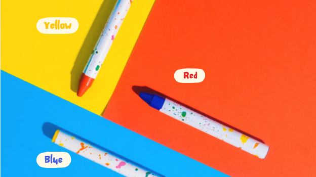
Colors can evoke emotions, and, in turn, prompt readers to take a desired action. For example, greens and blues are generally soothing, potentially leading to feelings of brand trust. Reds, yellows, and oranges can generate excitement and a sense of urgency—perhaps an urgency to make a purchase, react to a post, sign up for a service, or follow some other call to action.
Bright colors draw a reader’s attention, but exercise caution—if every part of your document is brightly colored, nothing will stand out. Try using the same color temperature to unify your document or contrasting warm, cold, or neutral tones to make a big visual impact.
Speaking of contrast, make sure there is enough of it that your text is readable even if the saturation of the document is different. Try printing it in black and white. If you can still read everything easily, you’re good to go. If not, adjust your color scheme.
Finally, consider your brand’s color palette. Consistency builds trust, influencing readers to feel like they “know” the company they’re dealing with. It can also evoke a sense of nostalgia, which has been linked to an increased likelihood of purchase.
Proximity, Figure, and Ground
Readers will assume that items in close proximity—grouped together—are associated in some way. Use this knowledge to guide the eye. Think about it in terms of providing the reader with the information they need to decide to follow the call to action. The call to action itself should be the last item the eye is drawn to.
Make sure text elements are perceived as figures—that they are in focus and easily visual. Avoid fonts that give a sense of pixelation or fuzziness. Don’t use images behind text, unless the intention is that they fade to ground—the background, which is perceived as less important.
Step 3: Save in the Correct Format

You’ve put a lot of work into your document, but this final step can make or break clarity and impact. Make sure you save or export the document in PDF format. This is true whether you’re making a single page or an entire book in PDF format.
Why is PDF format important? It preserves the integrity of your document. How?
- PDFs cannot be changed as easily as other document types, so other parties cannot accidentally or purposefully insert errors.
- PDFs preserve formatting across documents and programs, preventing text and images from being skewed, overlapping, or squished together.
Additionally, PDFs are a universal standard in document sharing and can be opened on virtually any device, whether it’s a computer, tablet, or smartphone. This is not true of all file types. For example, if you were to use Adobe Photoshop to create your document, a recipient without the Photoshop program could not open your document with a .PSD file extension.
In many programs, such as Photoshop, you can select “Save As,” and then click “.PDF” from the drop-down menu. In other programs, such as Microsoft Word or Google Docs, you will select “Export” and then “Export as PDF.” Among the tools that can be used to make changes to PDFs, it is worth mentioning such services as Adobe Acrobat, SwifDoo PDF. What is worth knowing about more alternative options and which one to choose for yourself? You can read more about them and about editing PDF files in this material.
Key Takeaways
You don’t need a background in graphic design to create an impactful and clear document. Simply remember to double-check and proofread your copy, apply the principles of visual hierarchy, and always save in PDF format. If you do so, your readers will efficiently and contentedly receive the information they need.
When they follow your call to action, you’ll be that much closer to reaching your business or career goals.


